Explore plotting vector data using
plot,spplot, andggplot2Explore plotting raster data using
plot,rasterVizMap multiple layers using
spplot,ggplot2
2/1/2020
Today’s objectives
Building a vector dataset
census_api_key("90b94953d2f24e81e890229e0128174f5ba80d3f")
# download censu data
id.income <- get_acs(geography = "county", variables = c("B19013_001",
    "B01002_001"), state = "ID", year = 2018, geometry = TRUE) %>%
    mutate(rename = str_replace_all(.$variable, (c(B19013_001 = "income",
        B01002_001 = "age")))) %>% # select the columns to keep
dplyr::select(c(GEOID, rename, estimate)) %>% # have to use spread because pivot_wider not currently
# working for sf objects
spread(., key = rename, value = estimate)

# join our nonprofit data set
id.nonprof <- read.csv("./data/bmfcount.csv", stringsAsFactors = FALSE,
    colClasses = "character")

id.census.sf <- id.income %>% left_join(., id.nonprof, by = c(GEOID = "FIPS"))

id.census.sp <- as(id.census.sf, "Spatial")
Plotting spatial data in base plot
- Base
plothandlesSpatial*andsfobjects differently - Base
plotis useful for quick exploration of data and figure drafting
Plotting spatial data in base plot
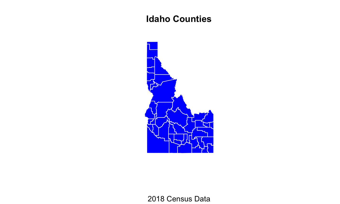
plot(id.census.sp, main = "Idaho Counties", sub = "2018 Census Data",
    col = "blue", border = "white")
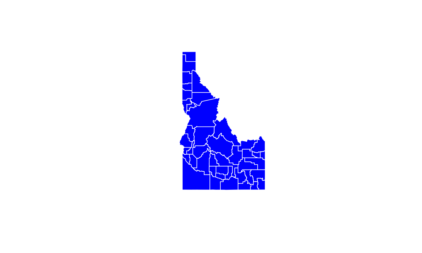
Plotting sf data in base plot
plot(id.census.sf, main = "Idaho Counties", sub = "2018 Census Data",
    col = "blue", border = "white")
Plotting sf data in base plot
# if you just want the sf geometry
plot(st_geometry(id.census.sf), col = "blue", border = "white")
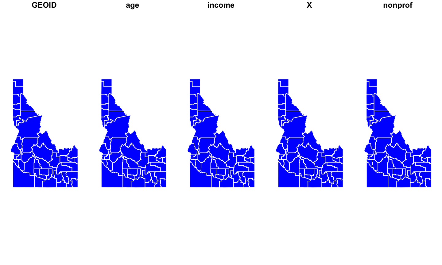
Plotting attributes of Spatial* data in base plot
# hard to plot by attributes in base plot with Spatial*
# objects
plot(id.census.sp$income)
# Easier with sf
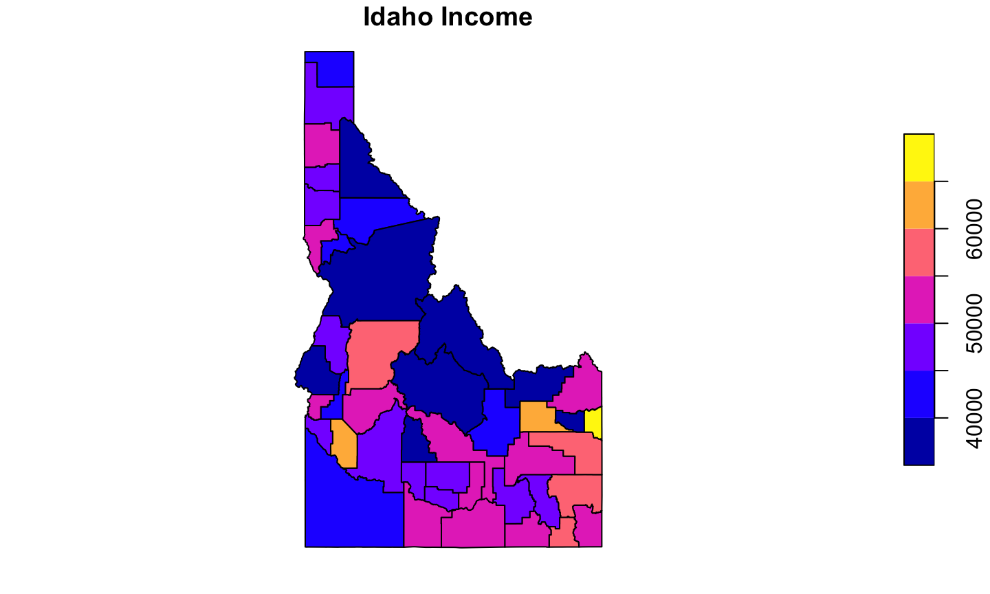
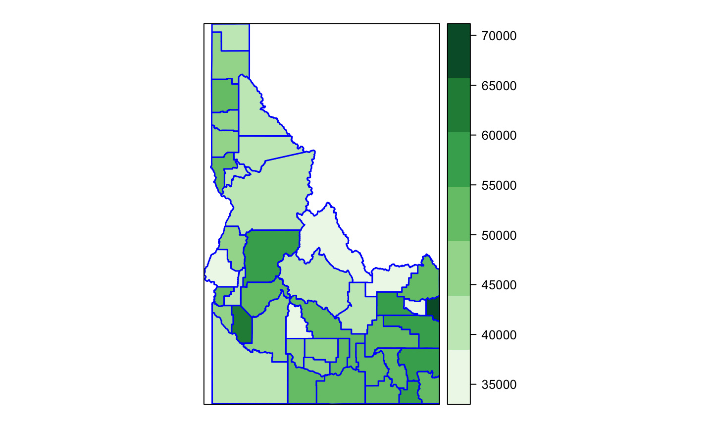
Plotting attributes of sf data in base plot
plot(id.census.sf["income"], main = "Idaho Income", sub = "Median county value as of 2018")
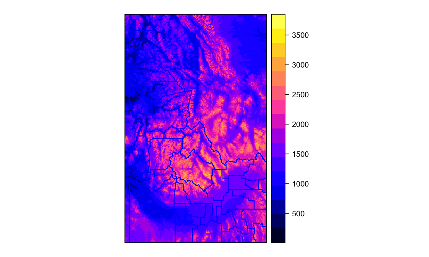
Plotting raster data in baseplot
id.elev <- raster("data/id_elev.tif")
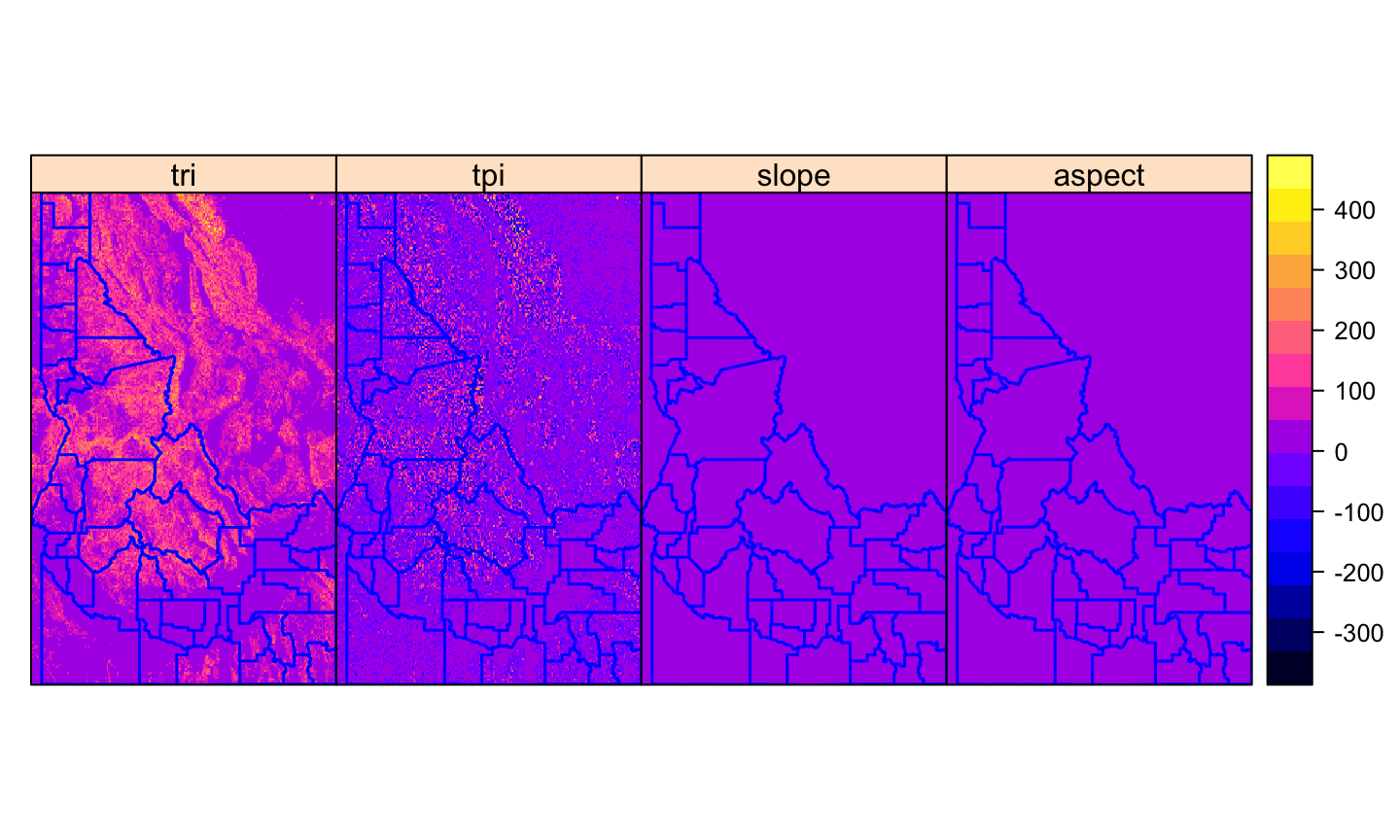
Plotting raster bricks in baseplot
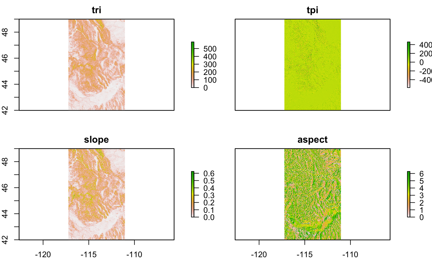
# create a reaster brick
id.terrain <- terrain(id.elev, opt = c("slope", "aspect", "TRI",
    "TPI"))
plot(id.terrain)
Adding functionality with spplot
spplotfollows thelatticeapproach for creating graphicsAllows functionality for
Spatial*objects similar to those forsfin baseplot
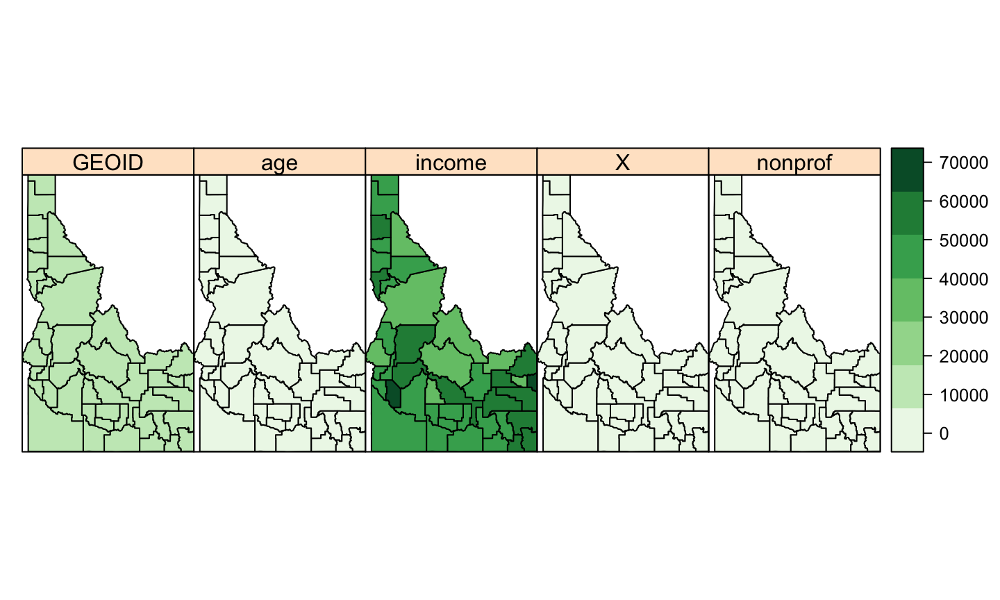
# set up a color palette
income.pal <- brewer.pal(n = 7, name = "Greens")
spplot(id.census.sp, col.regions = income.pal, cuts = 6)
Plotting a single variable in spplot
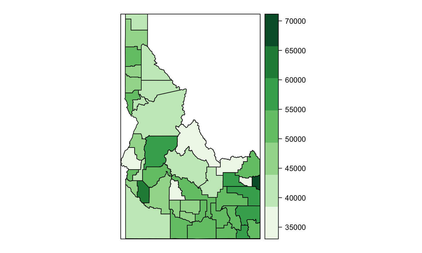
spplot(id.census.sp, "income", col.regions = income.pal, cuts = 6)
Adding layers
Rare that we only want to visualize one aspect of spatial data
Adding layers allows additional information and detail
Important to ask “is a map the best way to display this?”
Adding layers in spplot
add layers using
listandsp.layoutorder matters!!
Adding layers in spplot
county.layer <- list("sp.polygons", id.census.sp, fill = "transparent",
    col = "blue", lwd = 1.5, first = FALSE)

spplot(id.census.sp, "income", col.regions = income.pal, cuts = 6,
    sp.layout = county.layer)
Adding rasters in spplot
spplot(id.elev, sp.layout = county.layer)
Adding rasters in spplot
spplot(id.terrain, sp.layout = county.layer)
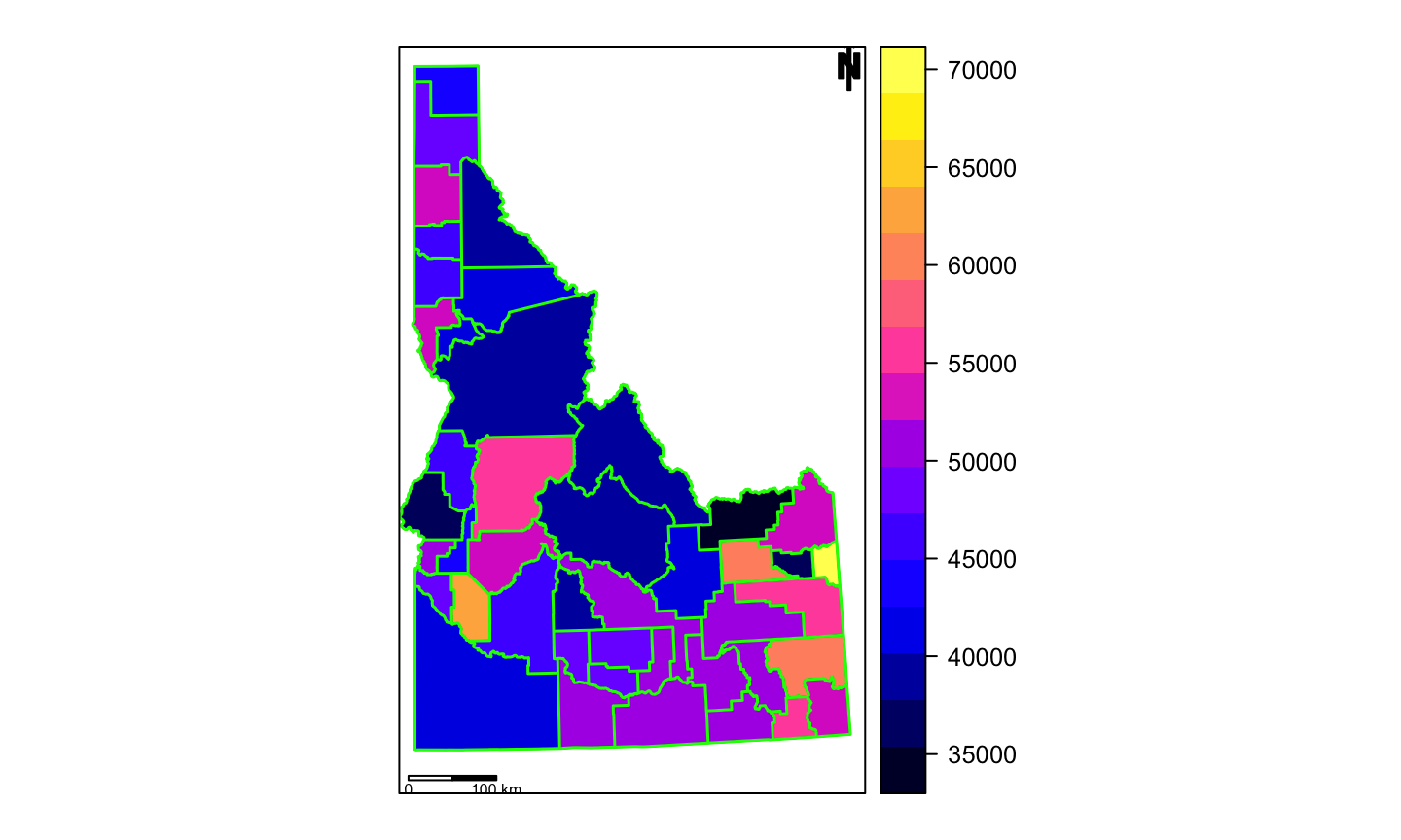
Adding map elements with spplot
You’ll often want additional components for maps
These can also be added with
sp.layoutNeed to specify size and coordinates for elements
Adding map elements with spplot
id.proj <- spTransform(id.census.sp, CRS("+init=EPSG:32611"))  # Can't make a scale if not projected!
id.proj@bbox  # Check dimensions to help guide offset choices
##         min     max
## x  480643.9  993117
## y 4649552.9 5427992
# expand bbox to make room for map elements
new.bbox <- matrix(c(480000, 1010000, 4600000, 5450000), ncol = 2,
    byrow = TRUE, dimnames = list(c("x", "y"), c("min", "max")))
id.proj@bbox <- new.bbox
bbox(id.proj)  #check new bbox
##       min     max
## x  480000 1010000
## y 4600000 5450000
county.layer <- list("sp.polygons", id.proj, fill = "transparent",
    col = "green", lwd = 1.5, first = FALSE)

scale <- list("SpatialPolygonsRescale", layout.scale.bar(), scale = 1e+05,
    fill = c("transparent", "black"), offset = c(490500, 4615000),
    first = FALSE)

# The scale argument sets length of bar in map units
text1 = list("sp.text", c(490500, 4604800), "0", cex = 0.5, first = FALSE)
text2 = list("sp.text", c(590500, 4604800), "100 km", cex = 0.5,
    first = FALSE)

arrow = list("SpatialPolygonsRescale", layout.north.arrow(),
    offset = c(980000, 5400000), scale = 60000, first = FALSE)
Adding map elements with spplot
spplot(id.proj, "income", sp.layout = list(county.layer, scale,
    text1, text2, arrow))
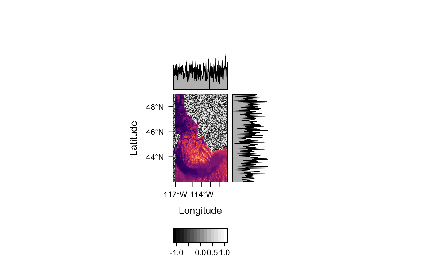
Using rasterViz for plotting multiple rasters
rasterVizalso builds onlatticeapproachlots of functionality for space, time, and spacetime data
especially useful for layering
rasters
Using rasterViz for plotting multiple rasters
# build a hillshade
id.hills <- hillShade(id.terrain[[1]], id.terrain[[2]], angle = 40,
    direction = 270)
hills <- levelplot(id.hills, par.settings = GrTheme())
# crop raster - make sure projections match!
elev.crop <- mask(id.elev, id.census.sp)
elev.lp <- levelplot(elev.crop)
# combine rasters
hills + elev.lp
Fancier graphics with ggplot2
ggplot2built on grammer of graphicsPlots build in layers denoted by different
geom_,aes, andscale_Lots of functionality, but slow
Fancier graphics with ggplot2
# get tract-level income data
tv.income.tct <- get_acs(geography = "tract", variables = "B19013_001",
    state = "ID", year = 2018, geometry = TRUE) %>% filter(str_detect(NAME,
    "Ada | Boise | Canyon | Gem | Owyhee"))

cty.map <- ggplot() + geom_sf(data = id.census.sf, fill = "gray")
Adding layers in ggplot2
cty.map + geom_sf(data = tv.income.tct, aes(fill = estimate)) +
    scale_color_viridis()
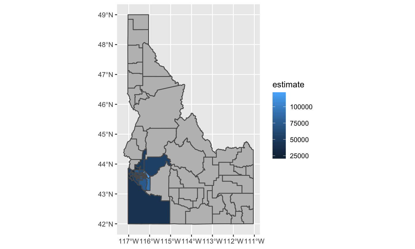
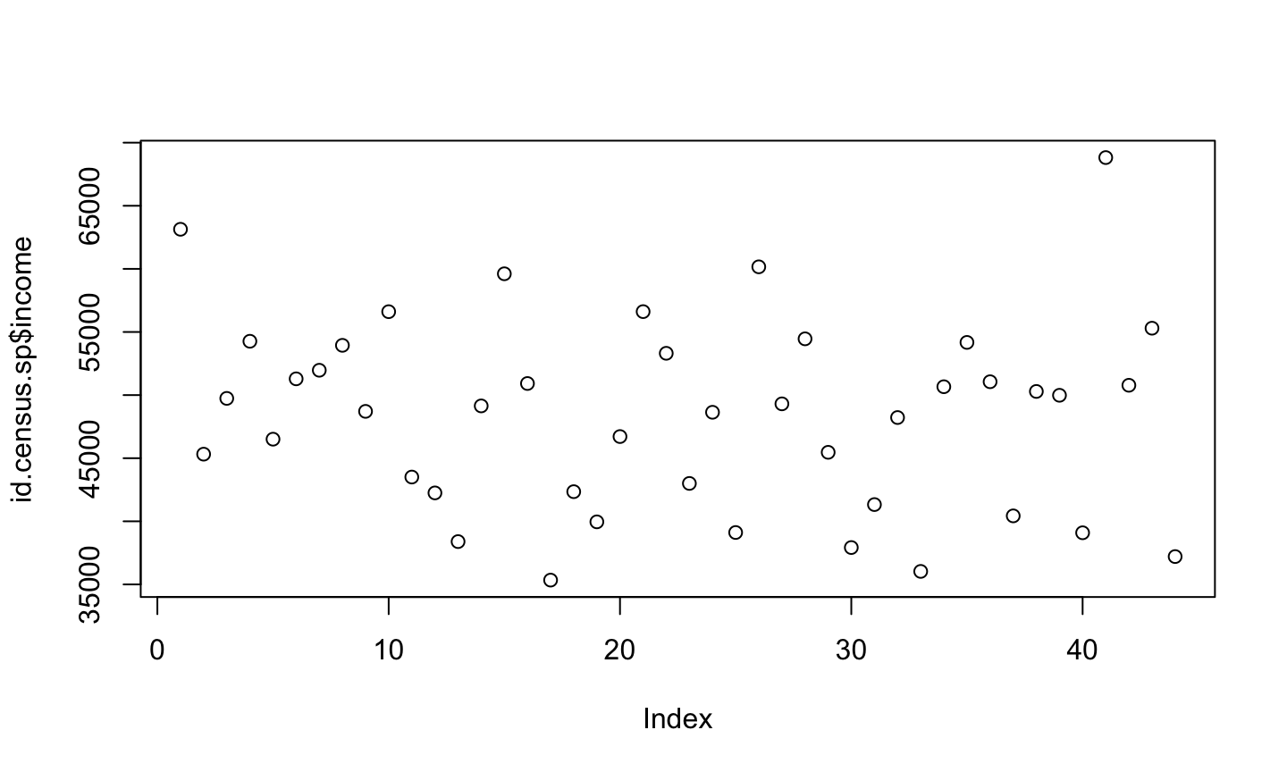
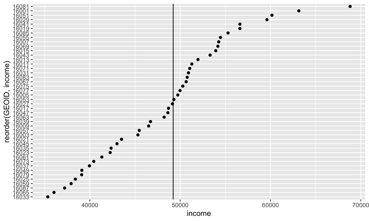
Is this a reasonable way to look at this data?
med.inc <- median(id.census.sf$income)

ggplot() + geom_point(data = id.census.sf, aes(x = income, y = reorder(GEOID,
    income))) + geom_vline(xintercept = med.inc)
Looking Ahead
Plotting in R can be slow, we’ll explore options in “Repetitive tasks, functional programming, and bench-marking”
We will explore base-maps, multi-panel graphics, combined plots, and more complex layouts in “Next Level Visualization”
We can explore interactive and web-based maps using the
leafletRandtmappackages in “Flex Dashboards, web mapping, and interactive maps”
Additional references
Data Visualization: A Practical Introduction by Kieran Healy